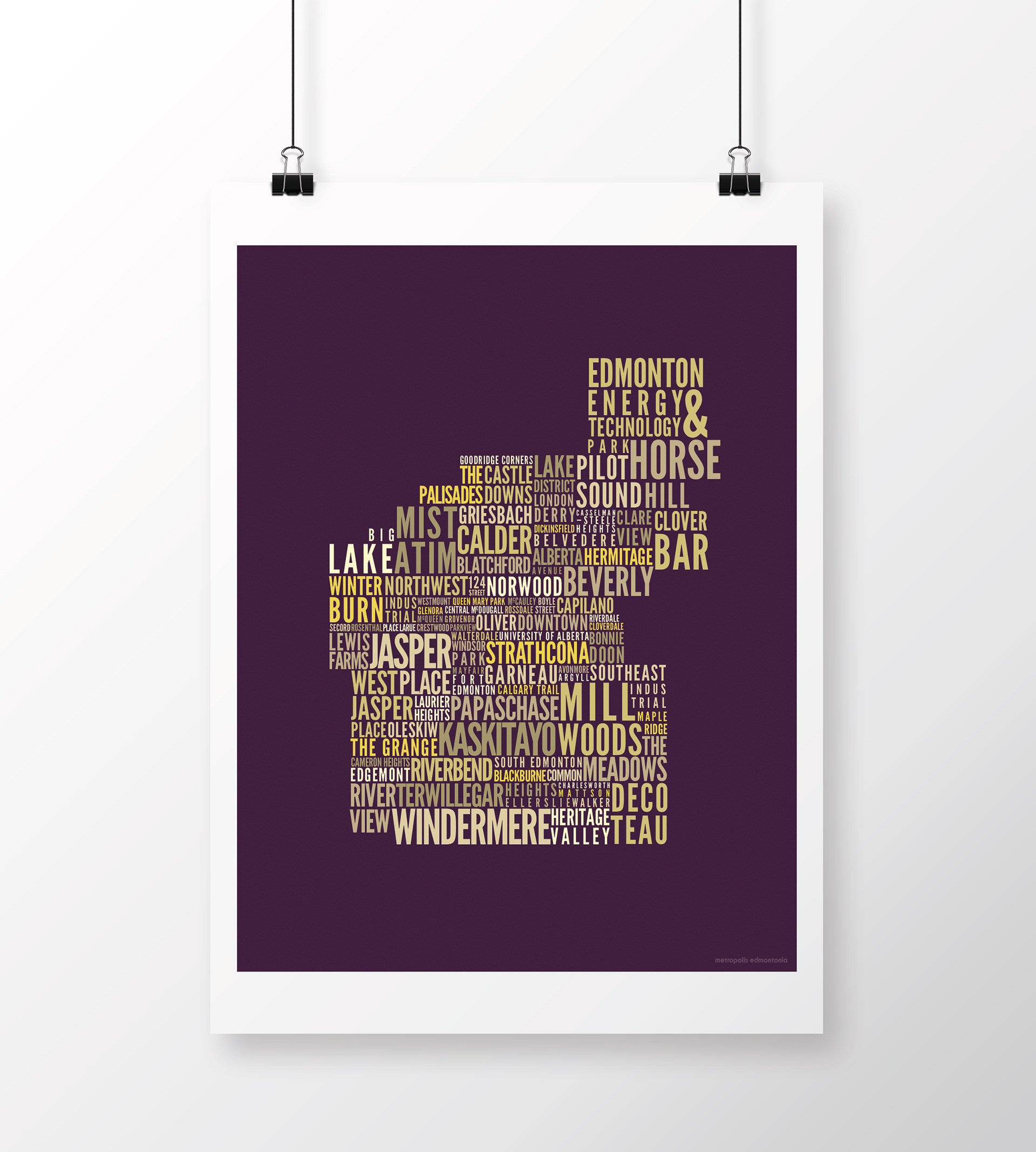
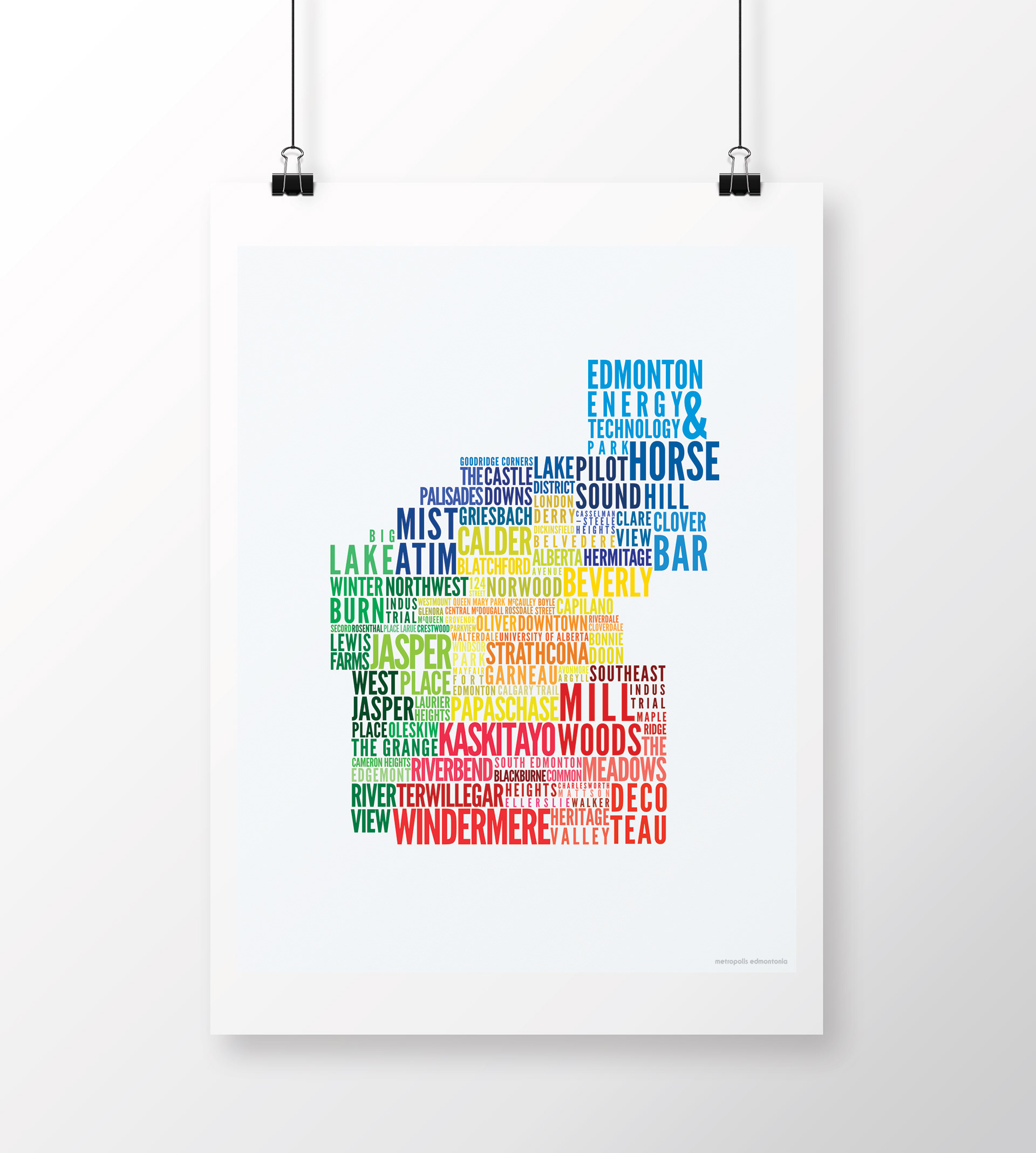
A typographic map of Edmonton and its residential areas.
☞ typography, cartography
☞ personal project

Context
Toponyms (or place-names) hold important historical information about place, telling the story of community settlement, languages, and social values and shifts. They function cognitively as geographical references, but they also work on emotive, ideological, and community-building levels. These names become part of linguistic and local identities, and have value as historical documentation, linguistic heritage, and descriptors of the land and our relationship to it.
Process
At the intersection of two deep interests (visual design and human geography), this typographic map project was born out of a desire to explore Edmontonness and one of many facets of my hometown's complex history. Completing this project required a strong understanding of the geographical nuances of Edmonton neighbourhoods and communities. This information was crucial to making decisions about what to represent and how.
I aimed to be inclusive of as much of Edmonton as possible without being too overwhelming. For this reason, I decided to generally represent Edmonton communities at the level of the residential area (or groups of neighbourhoods) where possible and filling in remaining gaps at the level of the neighbourhood. I also tried to include place-names of historical or cultural significance, regardless of whether or not they fit with the idea of ‘neighbourhood’ or ‘residential area’, such as Norwood, 124 Street, Mayfair, and Papaschase.
Concept
The design uses four main colours to demarcate north, west, south, and central areas of the city. Variations in colour parallel those in type size and provide visual interest to the overall composition. A second version of the design is set in the official colours of Edmonton, violet and gold.