A visual identity for an academic conference set in a fictional post-dystopian setting.
☞ visual identity design
☞ student project
Context
Visual identities are complex systems of designed visual elements that altogether express the essence of a branded entity. They serve to visually unify the component parts of the entity while doing the work of both communicating the nature and purpose of the brand and creating an emotional impression on viewers.
Process
Conferences, as with many other large-scale events, have a high level of complexity in terms of purpose, function, visibility, and materiality, making them fitting contexts for visual identities.
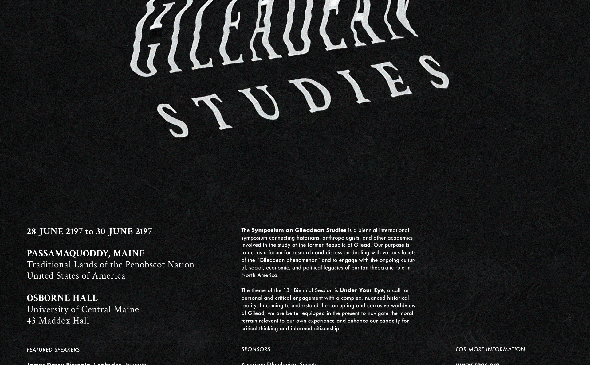
A conference that drew my curiosity was the Symposium on Gileadean Studies, a fictional historical conference depicted in the epilogues of two of Margaret Atwood’s novels, The Handmaid’s Tale and The Testaments. In that fictional universe, the Symposium is a biennial international forum for research and discussion for academics who study the puritan, totalitarian former Republic of Gilead.
In order to alter the recurring perception of history as a dry, overly academic subject, I built this identity around more visceral aspects of this conference’s content, visually communicating the brutal, corrupt, and dystopian nature of Gilead. The initial logo design formed the basis for a visual identity, which then branched out into thematic exploration and eventual application.
Concept
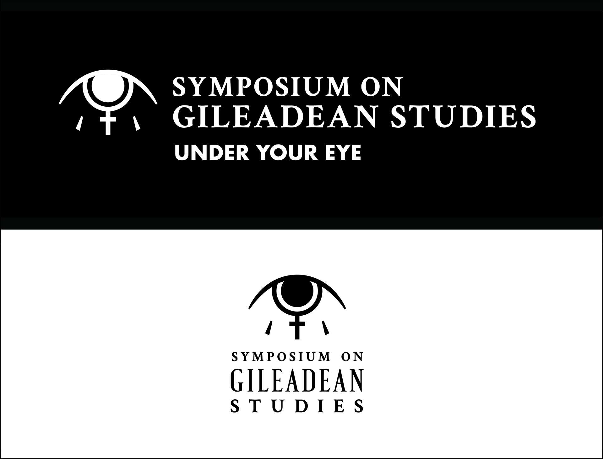
An 'Eye of Gilead' logo was derived from the symbolic significance of the eye in Atwood’s novels, with additional reference to ideas of gender and religion. The theme, copy, and colour used throughout the identity were also derived from details in the novels. A recurring visual motif that unifies the identity is type treated with distortion effects, referencing the corrupting influence of Gileadean state power.
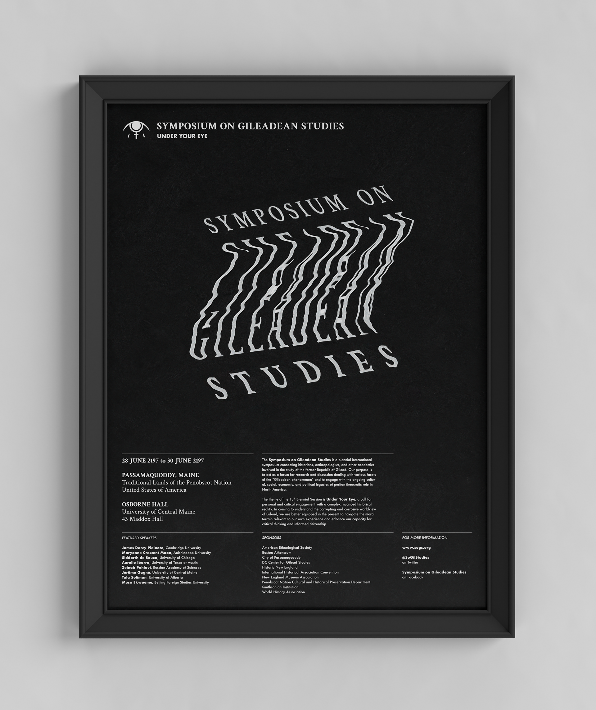
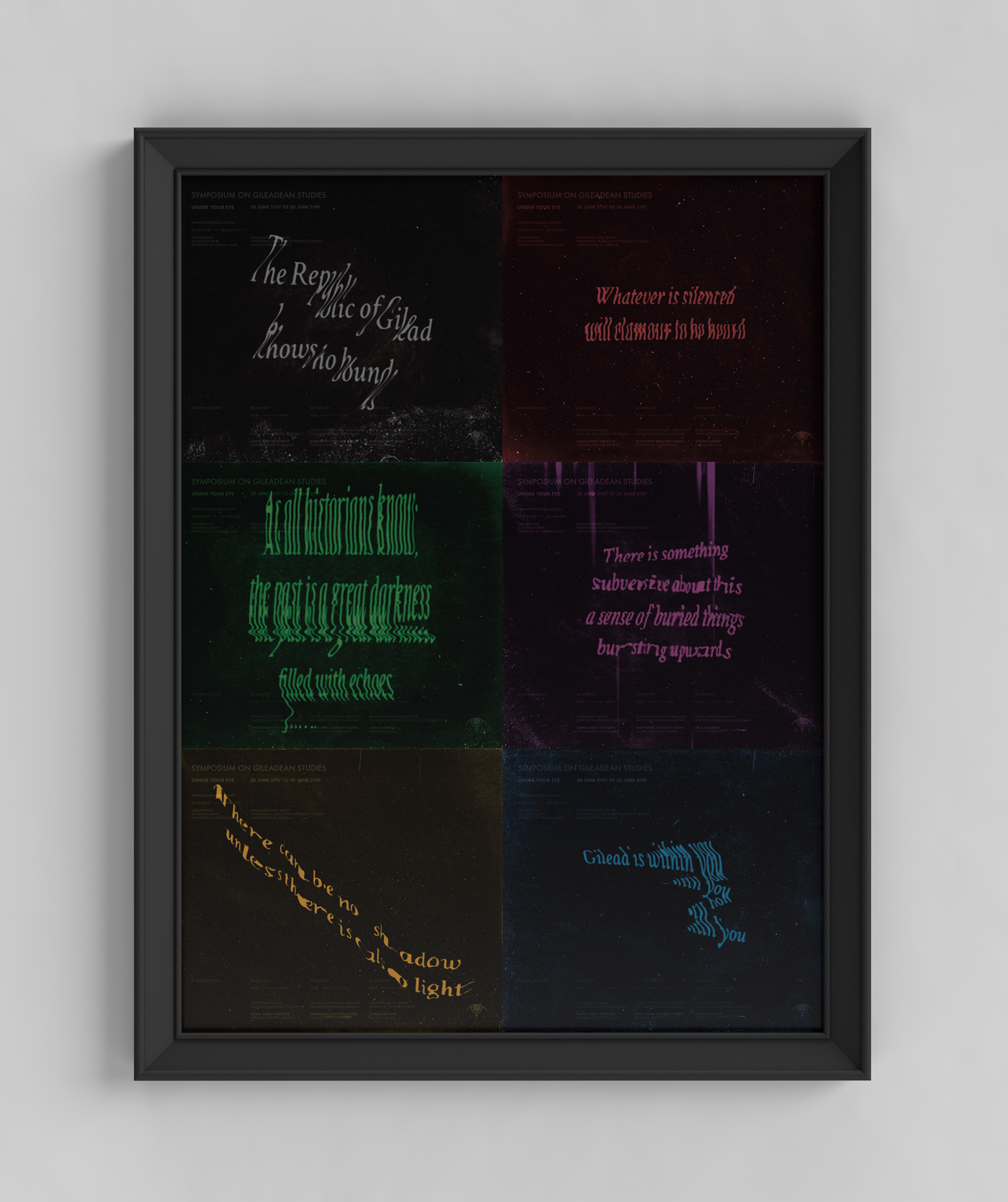
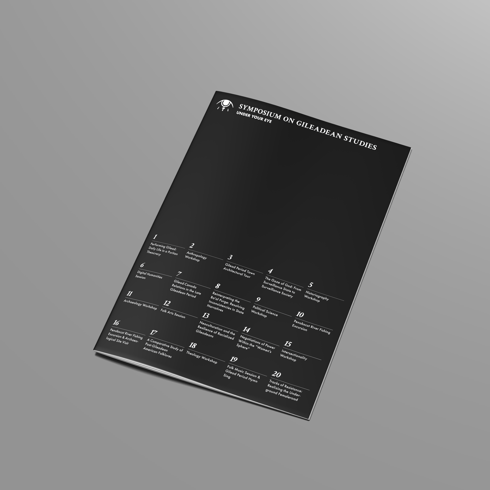
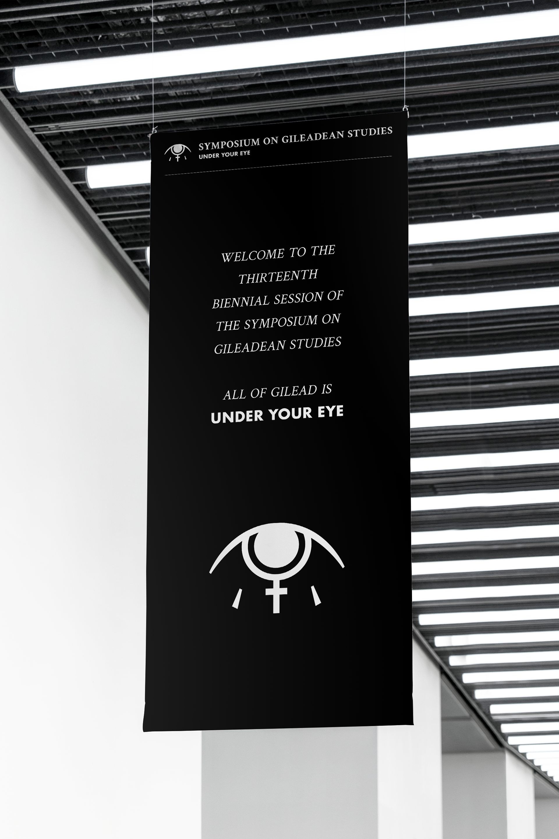
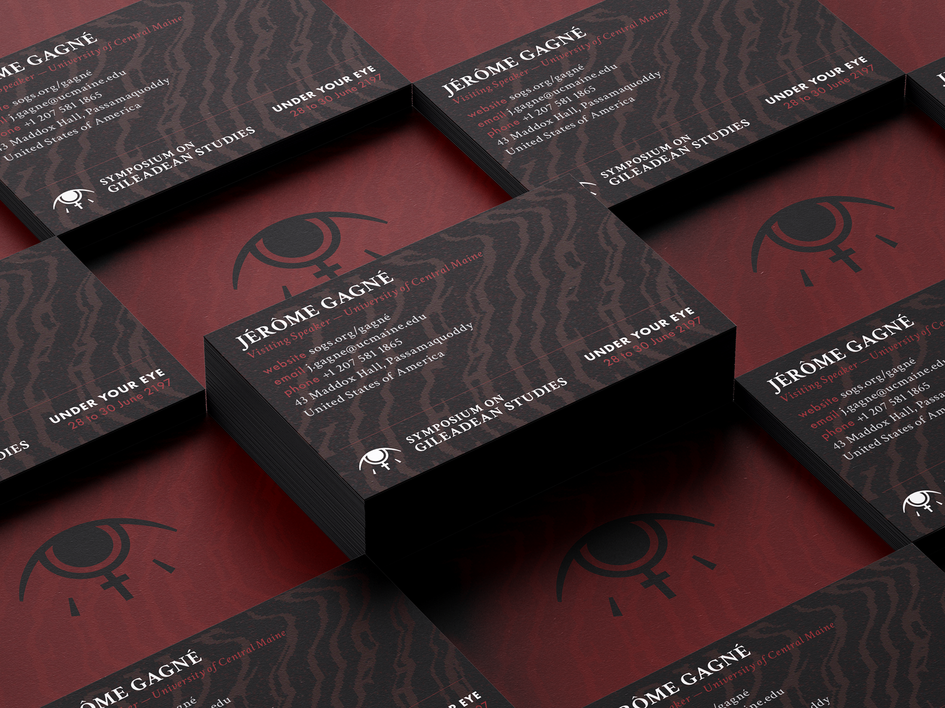
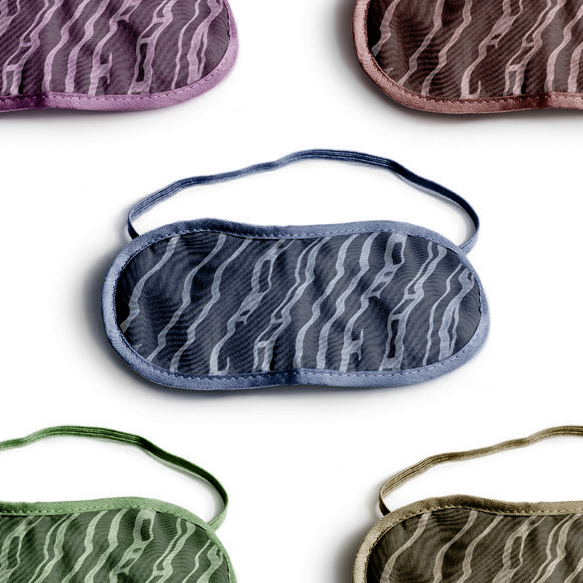
Beyond a logo, the project includes a double-sided poster, business cards, a conference program, textile and swag items (webcam covers and sleep masks — playing on the theme of eyes and sight), and other identity applications. Throughout my system, I use black as a dominant colour as a reference to the dark historical content, and I juxtapose the shadowy treatment of text with a more rigid modernist structure in order to aestheticize the historical content.