A logo for a student cultural group that represents the hybrid nature of its community.
☞ logo design
☞ client work
Context
Throughout my university career, I made the deliberate decision to contribute to campus life through involvement in student groups, one of which was the University of Alberta Philippine Students’ Association. Elected as Vice President Communications in its founding year, part of my portfolio was to establish the foundation for a visual identity that would aptly represent the new group. For the purpose of the group, that simply meant creating a logo. This task would become what I consider to be my first major design project.
Process
Although I did not have any formal design education or experience at the time, I had familiarized myself with some basic concepts and had long-standing design interests without realizing that they actually were design interests. As such, my process was largely based on intuitive gesturing. Still, the seeds of design thinking were there, in the form of informal research and sketches, soliciting feedback, refining a chosen concept, and providing a set of deliverables.
Concept
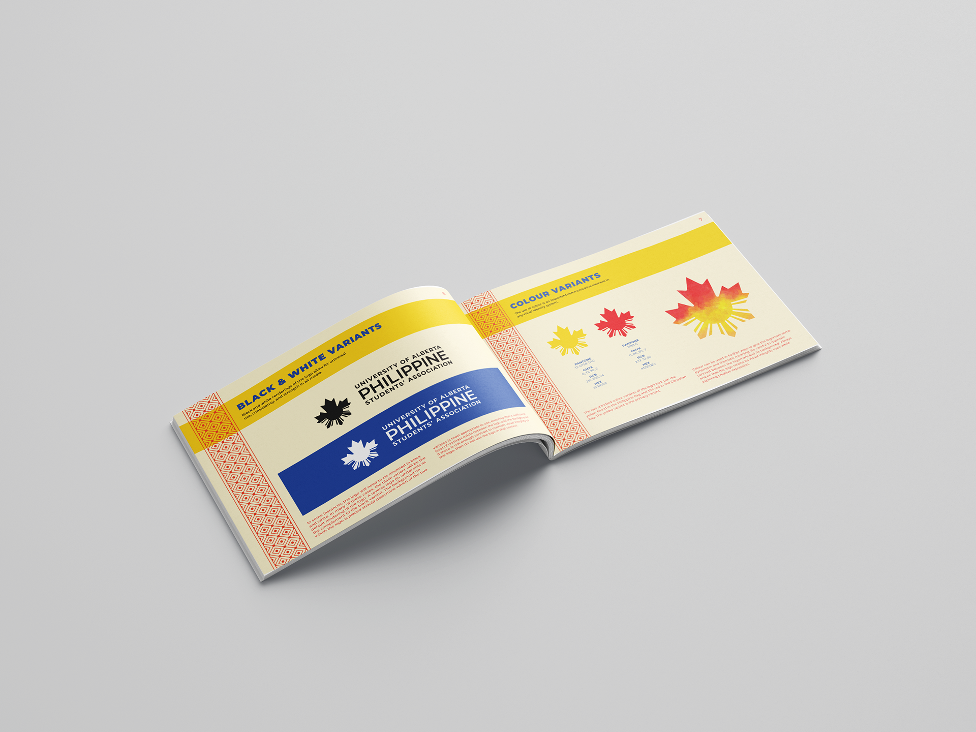
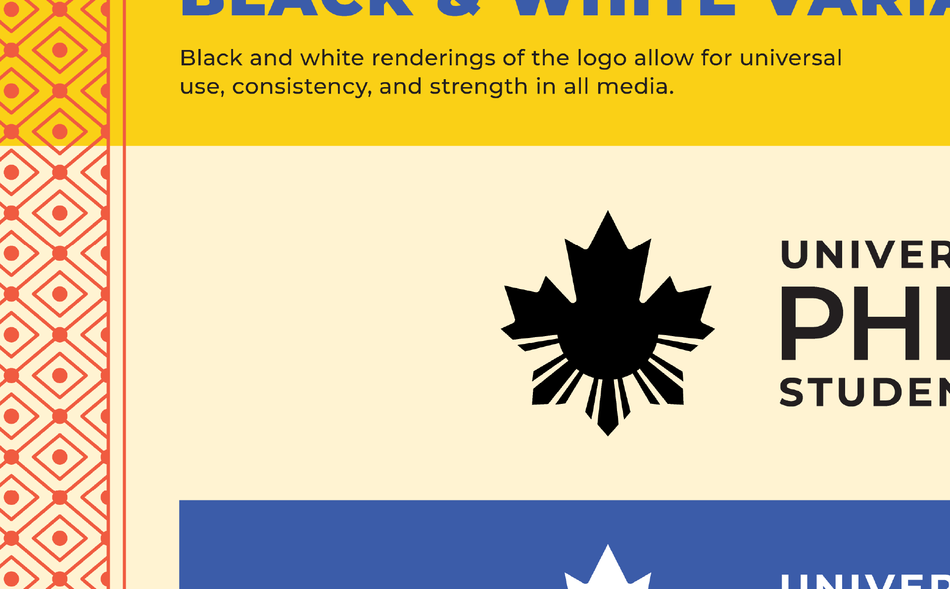
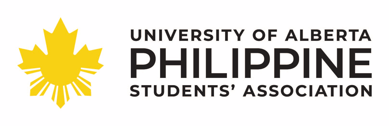
My final concept drew on the idea of hybridity, acknowledging the two main cultures that came together in the student group. This manifested in the combination of two prominent cultural symbols that feature on two national flags, the Canadian maple leaf and the Philippine sun.
While my design knowledge and skill set at the time of creating this logo was nowhere near as extensive or refined as it is now, I am proud to say that my design has endured on campus for a decade (some necessary evolutionary changes notwithstanding) and is still used prominently by PhilSA across a broad selection of applications. In 2020, I created a logo specifications manual (a long time coming!) as a resource for the group to use to their advantage.